The Art of Visual Rhetoric
As I have previously mentioned, I could be more useful regarding anything digital. Due to this seemingly minor fact, I have struggled during several parts of the Digital Writing 307T class. When I got to chapter four, I finally felt I understood the content I was reading. Growing up with a deep interest in art and, mainly, drawing, the definitions of visual rhetoric seemed like a recap of every art class I had ever taken. Fluidity in a piece, spacing, line language, symmetry, and shapes go into every artwork I procure. In the readings in chapter four, an emphasis was put on font and hypertext, but I wish to dive into the aspects of elements and shape language.
When I draw, the rules of visual rhetoric come naturally to me. Obviously, font is something I only sometimes consider when I am buried in my sketchbook, but a non-artist would be surprised by how often words and font type are considered. Take, for example, collages. Collages are artworks in which images and creations from various sources are taken apart and put back together uniquely. Often, magazines, books, and journals are used for these works; therefore, words and fonts must be considered to make an aesthetic piece. Ramage (2015) describes the ideas behind utilizing different kinds of fonts. Serif fonts are the main ones used for large bodies of text such as this blog post; sans serifs are more complicated, demanding a less prevalent use, and specialty fonts are just that-- special. Specialty and sans serif fonts are the fonts I use most commonly in artworks, though serif fonts are helpful depending on how many words appear.
With the usage of fonts in drawings comes the consideration of spacing. Spacing is essential in art and stands toe to toe with the elemental aspects. Line thickness, an element, is determined by spacing variance and the composition of a piece. The thicker the line, the heavier it appears; maybe a character is holding something heavy, so an artist would thicken the lines at the bottom of the object to visually exhibit this phenomenon. Spacing and the elements coincide again when it comes to symmetry. What does an artist wish to be the main focus of a work? Asymmetry forces a viewer's eye to a particular space in the work, whereas symmetry allows multiple viewpoints. These aspects work together to make an impact with dynamic creativity. These aspects can even showcase movement, spacing, and layout impacts how a person's eyes travel a page. The further apart each element is, the higher the activity is encouraged.
Though the occurrence of elements and spacing communicates with a viewer, shape language elevates this event. According to the Digital Writing 307T presentation by Virginia Tucker, the three categories of shapes hold many different meanings. Geometric shapes are severe and formal; take, for example, Sergeant Tamora from Wreck-It Ralph (the lady who kills bugs)-- more, her design. Though she is not a literal triangle or square, her plan is sharper and geometric shapes were considered. Organic forms are looser and lighter; think of Fix-It Felix from the same movie. He is short and flexible, demonstrating his bubbly personality simply in the ways of his design. Finally, abstract shapes act as a representation of something familiar. This can be seen most effortlessly in cartoonified versions of real people, i.e., caricatures.
As aforementioned, hypertext is not something I can really focus on in this blog post about art, as art typically sticks to one viewing ground rather than interwoven outlets. There is no ample space for hyper textuality because everything you should want to see is already there. That being said, the other aspects of visual rhetoric are there and make art what it is just as much as it would help a digital/visual advertisement. I am grateful that this chapter occurred so I could renew my motivation for this class and find an aspect I can connect with.
Psst...before you go, you can click this link here to view an infographic about this topic. Enjoy!
 |
| Original Character I drew. |
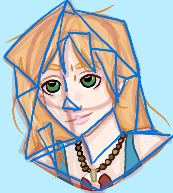 |
| The same character with the visual rhetoric of shape language highlighted. This character is very geometric and "sharp." |
Citations
Ramage, J. “REVEL for Writing Arguments A Rhetoric With Readings.” Pearson. 2015.
Tucker, V. “Visual Rhetoric.” Digital Writing 307T.

Comments
Post a Comment